![Implementing a Guided Tour with Expo [Complete Code]](/_next/image?url=%2Fimages%2Fblog%2Fonboarding%2Fthumbnail.png&w=3840&q=75)
The first impression can determine the success or failure of a mobile application. Thus, it's crucial to guide your users from their very first interaction with your application. By presenting a guided tour right after the completion of the signup process, the mobile application Fizl managed to increase the activation rate of its new users by 53%.
In this article, we explain step by step how to create your own guided tour using Expo, the development platform for React Native. To facilitate your implementation, the team at Fizl also provides a complete implementation in this GitHub repository.
Before you start, here's our best advice for creating your guided tour:
A well-designed guided tour is not just a tutorial; it builds an emotional connection with your users to encourage the adoption and continuous use of your mobile application.
If you need inspiration on how to build an effective guided tour, we invite you to download Fizl and experience the guided tour available to our users.
Prerequisites
To get the most out of this article, you should ideally have:
- Basic knowledge of the programming languages Javascript or Typescript
- Basic understanding of programming with React Native or React components.
- Basic knowledge of the Expo development platform.
Structure of a Guided Tour
For creating our guided tour, we will implement 3 types of components: Mask, Background, and Card.
Mask Components
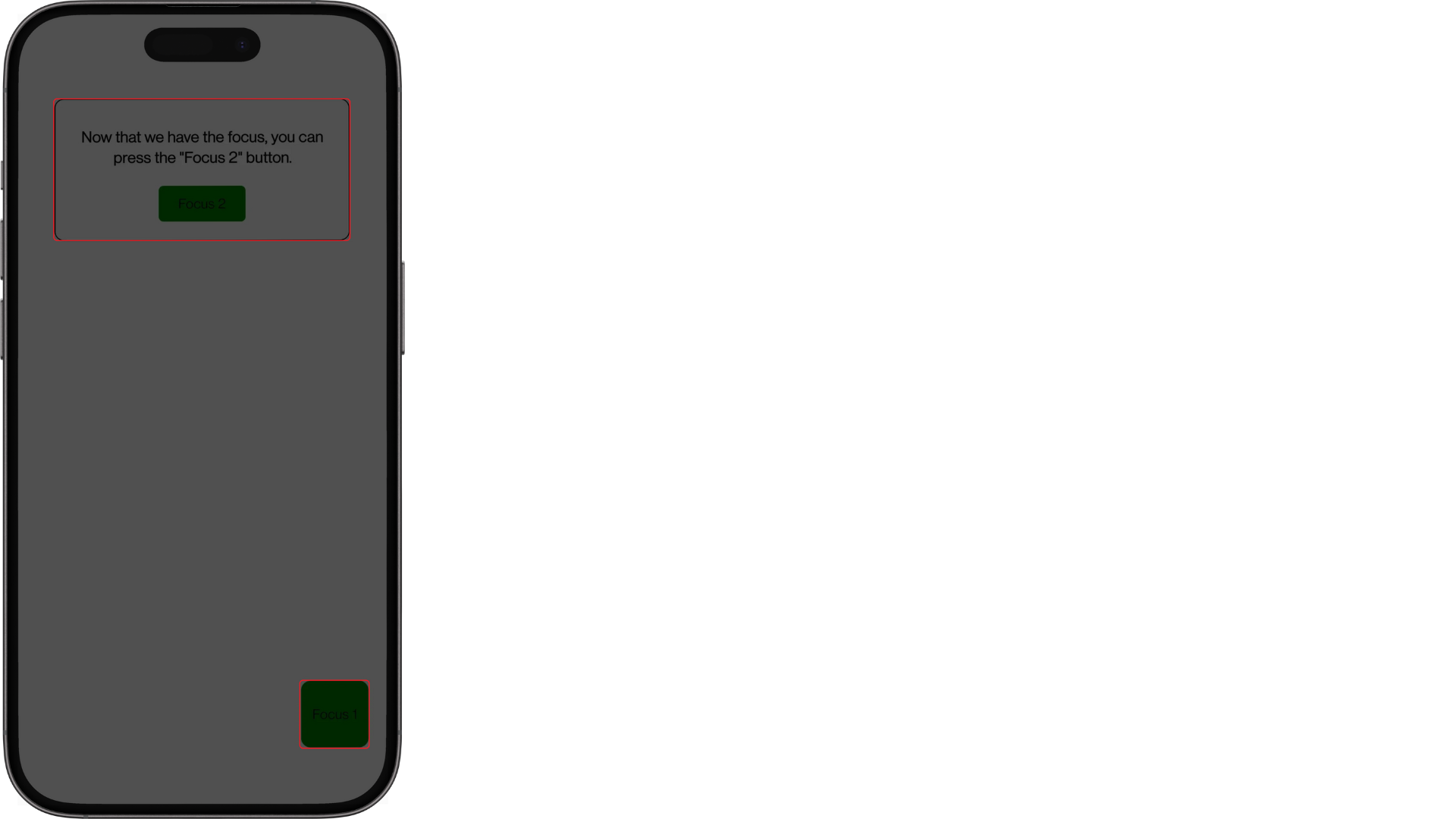
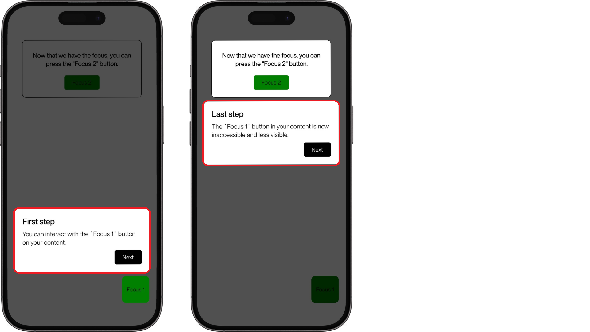
Mask components, composed solely of a View, play 2 important roles: defining the content to highlight and allowing the user to interact with this background content. For example, you will find the two Mask components implemented in the code provided outlined in red.
1. Defining the Content to Highlight
The content to highlight depends entirely on the experience you want to offer your users through your guided tour. However, we encourage you to centralize the style of your highlighted content to reuse it with your Mask:
/** ../styles/masks.ts */

export const MASK1_BOTTOM = 70;
export const MASK1_RIGHT = 20;
export const MASK1_HEIGHT = 70;

export const masksStyles = StyleSheet.create({
  mask1: {
    backgroundColor: "green",
    position: "absolute",
    bottom: MASK1_BOTTOM,
    right: MASK1_RIGHT,
    width: MASK1_HEIGHT,
    aspectRatio: 1,
    borderRadius: 10,
  },
  // ...masks
});
Tip: Use global variables to position your Mask, as they will be reused for Card and Background components.
2. Allowing Interactions with the Background Content
In React Native, the attribute pointerEvents="none" applied to a View indicates that it should ignore touch interactions. We use this technique to allow the user to interact with the content in the background of the Mask.
/** ../components/Masks.tsx */

import { StyleProp, View, ViewStyle } from "react-native";
import { masksStyles } from "../styles/masks";

export function Mask1({ style }: { style?: StyleProp<ViewStyle> }) {
  return <View style={[masksStyles.mask1, style]} pointerEvents="none" />;
}
Card Components
Card components are much simpler to implement and mainly serve to provide informative content and navigate through our guided tour. The main challenge you may encounter during their implementation is positioning, which must be in absolute position. For example, you will find the two Card components implemented in the code provided outlined in red.
Reminder: By using global variables to position your Mask, you can easily adjust the position of your Card.
/** ../components/Cards.tsx */

const styles = StyleSheet.create({
  card1: {
    position: "absolute",
    bottom: MASK1_BOTTOM + MASK1_HEIGHT + OFFSET,
    alignSelf: "center",
  },
  // ...cards
});
Background Components
Background components are not mandatory but prevent the user from interacting with the content that is not highlighted. A simple technique used at Fizl involves covering the interface with TouchableOpacity components, except for the Mask component, to capture events.
It's also important to add the pointerEvents="box-none" attribute to the parent View component to allow touch events to pass through and reach its child components. This will enable the user to interact with the TouchableOpacity and the highlighted content behind the Mask.
/** ../components/Backgrounds.tsx */

export function Background2({ onPress }: { onPress: () => void }) {
  return (
    <View style={styles.layout} pointerEvents="box-none">
      <TouchableOpacity
        activeOpacity={1}
        onPress={onPress}
        style={{ height: MASK2_TOP }}
      />
      <Mask2 style={{ position: "relative", opacity: 0 }} />
      <TouchableOpacity
        activeOpacity={1}
        onPress={onPress}
        style={{ flex: 1 }}
      />
    </View>
  );
}

const styles = StyleSheet.create({
  layout: {
    ...StyleSheet.absoluteFillObject,
    backgroundColor: "transparent",
  },
});
Implementing Your Guided Tour
Once the structure of our guided tour is in place, we only need to centralize our components in a masked view.
What is a Masked View
A masked view is a component that controls the display of its content based on the applied mask, similar to a star-shaped stencil on a drawing, which only reveals its shape on the sheet. We will use this component from the external library @react-native-masked-view/masked-view to create a visual effect where the relevant areas of our content are highlighted through Mask.
It is advised not to use
@react-native-community/masked-viewas it is deprecated and incompatible with React Navigation v6.
Centralizing Our Components
Gathering the Mask, Card, and Background components of your guided tour is done in three steps:
1. Creating a Layout
The layout is a simple View that will serve as a container for your Card and your MaskedView. To achieve the desired visual result, you should assign a backgroundColor: "#000" to this parent component.
/** ../App.tsx */

import RNMaskedView from "@react-native-masked-view/masked-view";
// ...imports

export default function App() {
  // ...

  return (
    <View style={styles.layout}>
      <MaskedView />
      {index === 0 && <Card1 onNext={handleNext} />}
      {index === 1 && <Card2 onNext={handleNext} />}
    </View>
  );
}

const styles = StyleSheet.create({
  layout: {
    flex: 1,
    backgroundColor: "#000",
  },
  // ...styles
});
Note: To allow users to interact with the Card, they must be added after your MaskedView component.
2. Implementing the MaskedView
The RNMaskedView component from the @react-native-masked-view/masked-view library accepts the maskElement attribute to define the Mask applied to the child components, including your content and Background. The style backgroundColor: "#00000050" applied to the View containing your Mask controls the visibility of your background content, where an increase in opacity will make your content more visible.
/** ../App.tsx */

import RNMaskedView from "@react-native-masked-view/masked-view";
// ...imports

export default function App() {
  // ...

  function MaskedView() {
    return (
      <RNMaskedView
        style={styles.container}
        maskElement={
          <View style={styles.masks}>
            {index === 0 && <Mask1 />}
            {index === 1 && <Mask2 />}
          </View>
        }
      >
        <Content />
        {index === 0 && <Background1 onPress={onBackgroundPress} />}
        {index === 1 && <Background2 onPress={onBackgroundPress} />}
      </RNMaskedView>
    );
  }

  // ...
}

const styles = StyleSheet.create({
  // ...styles
  container: {
    backgroundColor: "#000000",
    flex: 1,
  },
  masks: {
    flex: 1,
    backgroundColor: "#00000050",
    width,
    height,
  },
});
3. Controlling Interactions
At this stage, you should already be able to visualize your work. To control your user's interactions with your guided tour, you just need to implement the onNext() and onBackgroundPress() functions. The first function, executed from your Card, is crucial for updating index, which defines the progression of your user in your guided tour.
/** ../App.tsx */

export default function App() {
  const [index, setIndex] = useState<number>(0);

  function handleNext() {
    setIndex(index + 1);
  }

  function onBackgroundPress() {
    Alert.alert("Background pressed!");
  }

  // ...
}
Optimizations
Due to their implementation, MaskedView are parent components of your content, which can lead to performance issues for complex applications. Here are two strategies used at Fizl to address this problem.
1. Display the MaskedView Only When Necessary
To minimize the impact on the performance of your application when the user is not following your guided tour, we recommend limiting the display of the MaskedView to only when necessary. Here's a simple example to achieve this goal:
/** ../App.tsx */

export default function App() {
  // ...

  return shouldRenderGuidedTour ? (
    <View style={styles.layout}>
      <MaskedView />
      {index === 0 && <Card1 onNext={handleNext} />}
      {index === 1 && <Card2 onNext={handleNext} />}
    </View>
  ) : (
    <Content />
  );
}
2. Limit the Scope of Your MaskedView
If your application implements complex navigation with @react-navigation/native-stack and @react-navigation/bottom-tabs, sharing the same MaskedView between the pages of your NativeStackNavigator and BottomTabNavigator can quickly become a challenge, not to mention the significant performance issues when changing the state of a page in your NativeStackNavigator. We recommend limiting the scope of your MaskedView and, if necessary, using a useContext to track the progression of your user on other pages.
Conclusion
A guided tour offers a unique opportunity to facilitate onboarding on your mobile application to improve the activation rate of your users. Thanks to the code provided in this GitHub repository, you have all the tools necessary to offer a personalized user experience from the opening of your mobile application.